
Preise Free

Pulse Chart
durch Microsoft Corporation
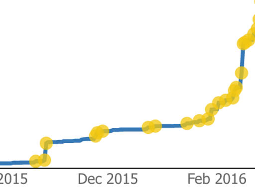
Line chart annotated with key events. Perfect for story telling with data
The Pulse chart shows key events on a timeline and lets you play back the events to reveal insights.
The Pulse Chart allows you to playback the data to see the trend unfold in front of your eyes. When an event appears, the playback pauses to filter the rest of the report, revealing hidden relationships. You can use this feature to grab your audience’s attention and highlight specific insights. There’s an auto play feature that starts the playback when the report loads. Pulse Charts are ideal for use with publish to web or when sharing reports with your coworkers.
When a data point is selected on the Pulse Chart, you get a customizable popup. You can specify the title and description, and show or hide the timestamp as well. This lets you clearly call attention to what’s important about the data point.
Creating a Pulse Chart is really easy -- you just need to provide data that is a time series. You add columns to the time series data that define the events you want to show on the line. For those columns, non-blank values become events and are shown as circles on the Pulse chart.
Visuelle Funktionen
Dieses Visual ist von Power BI zertifiziert.
Auf einen Blick

Andere Apps aus Microsoft Corporation

Text FilterMicrosoft Corporation Power BI visualsSearch across your dataset right from the dashboard
Applicable to:Power BI visuals
NaN out of 5
Word CloudMicrosoft CorporationPower BI visualsCreate a fun visual from frequent text in your data
Applicable to:Power BI visuals
NaN out of 5
GanttMicrosoft CorporationPower BI visualsA type of bar chart which illustrates a project timeline or schedule with resources
Applicable to:Power BI visuals
NaN out of 5
Chiclet SlicerMicrosoft CorporationPower BI visualsDisplay image and/or text buttons that act as an in-canvas filter on other visuals
Applicable to:Power BI visuals
NaN out of 5
Sankey ChartMicrosoft CorporationPower BI visualsFlow diagram where the width of the series is proportional to the quantity of the flow
Applicable to:Power BI visuals
NaN out of 5
Durch das Abrufen dieses Produkts erlaube ich Microsoft die Verwendung oder Freigabe meiner Kontoinformationen, damit der Anbieter mich bezüglich dieses Produkts und verwandter Produkte kontaktieren kann. Ich stimme den Nutzungsbedingungen und Datenschutzrichtlinie des Anbieters zu und verstehe, dass die Rechte zur Verwendung dieses Produkts nicht von Microsoft stammen, es sei denn, Microsoft ist der Anbieter. Die Verwendung von AppSource wird durch separate Geschäftsbedingungen und Datenschutz gesteuert.