Pricing Additional purchase may be required
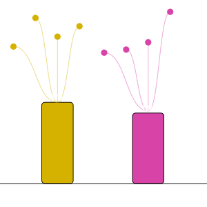
dandelion
by Excelnaccess.com
Compare different categories and their breakdown in one single view
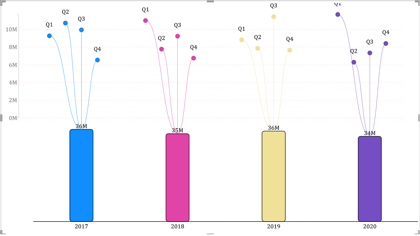
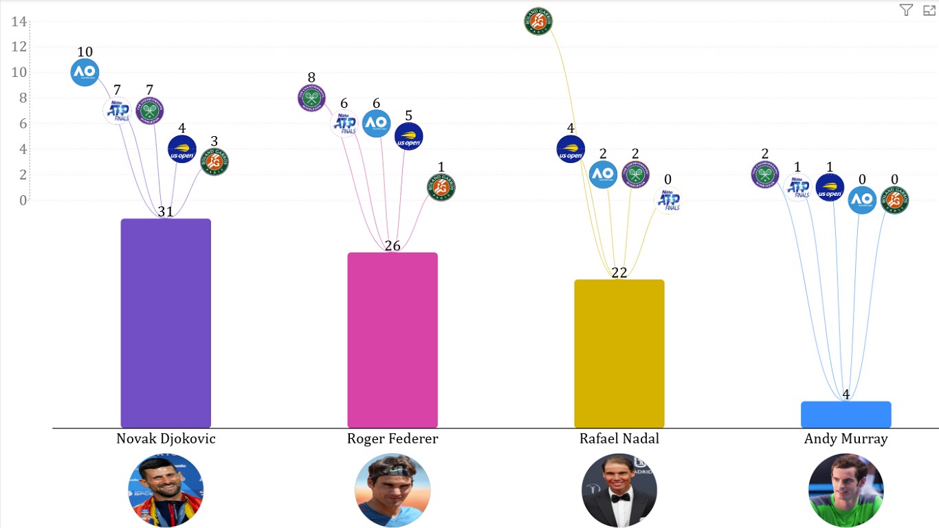
Dandelion chart visualizes your data in the form of a column chart plus the breakdown of your data as Dandelion flowers above the columns.
This visual offers a unique and wholistic way to depict the parent / child relationship between 2 fields in the "Category" section of the visual.
For example if you have yearly and monthly sales data, you can drag and drop "Years" and "Months" fields in the Category section and your sales value field in the Measure section of this visual. Your Yearly data will be depicted as column chart and its breakdown by months will be depicted as flowers above each column/bar.
All functionalities of this visual are available for free within Power BI Desktop. In Power BI Online Service, it will show a watermark. To use the visual without watermark in Power BI Online, please purchase license subscription For more information visit https://www.excelnaccess.com/dandelion/ or contact zubair@excelnaccess.com. Would love to get your feedback on this visual.
Visual capabilities
When this visual is used, it
- Can access external services or resources
At a glance
Other apps from Excelnaccess.com

Multiple SparklinesExcelnaccess.com Power BI visualsTransform your Table Data/ Numbers into Charts for stunning visual insights
Applicable to:Power BI visuals
NaN out of 4
decomposition_treeExcelnaccess.comPower BI visualsDecomposition tree visual lets you visualize data across multiple dimensions
Applicable to:Power BI visuals
NaN out of 4
Hierarchical Bar ChartExcelnaccess.comPower BI visualsThis visual displays hierarchical data in the form of bar chart with +/- signs to view/hide details
Applicable to:Power BI visuals
NaN out of 4
Beeswarm ChartExcelnaccess.comPower BI visualsVisualize distribution of data across different categories
Applicable to:Power BI visuals
NaN out of 4
By getting this product, I give Microsoft permission to use or share my account information so that the provider can contact me regarding this product and related products. I agree to the provider's terms of use and privacy policy and understand that the rights to use this product do not come from Microsoft, unless Microsoft is the provider. Use of AppSource is governed by separate terms and privacy.