
Dynamic Radial Bar Chart by JTA
por JTA The Data Scientists

Interactive drilldown radial bar chart with multiple configurations
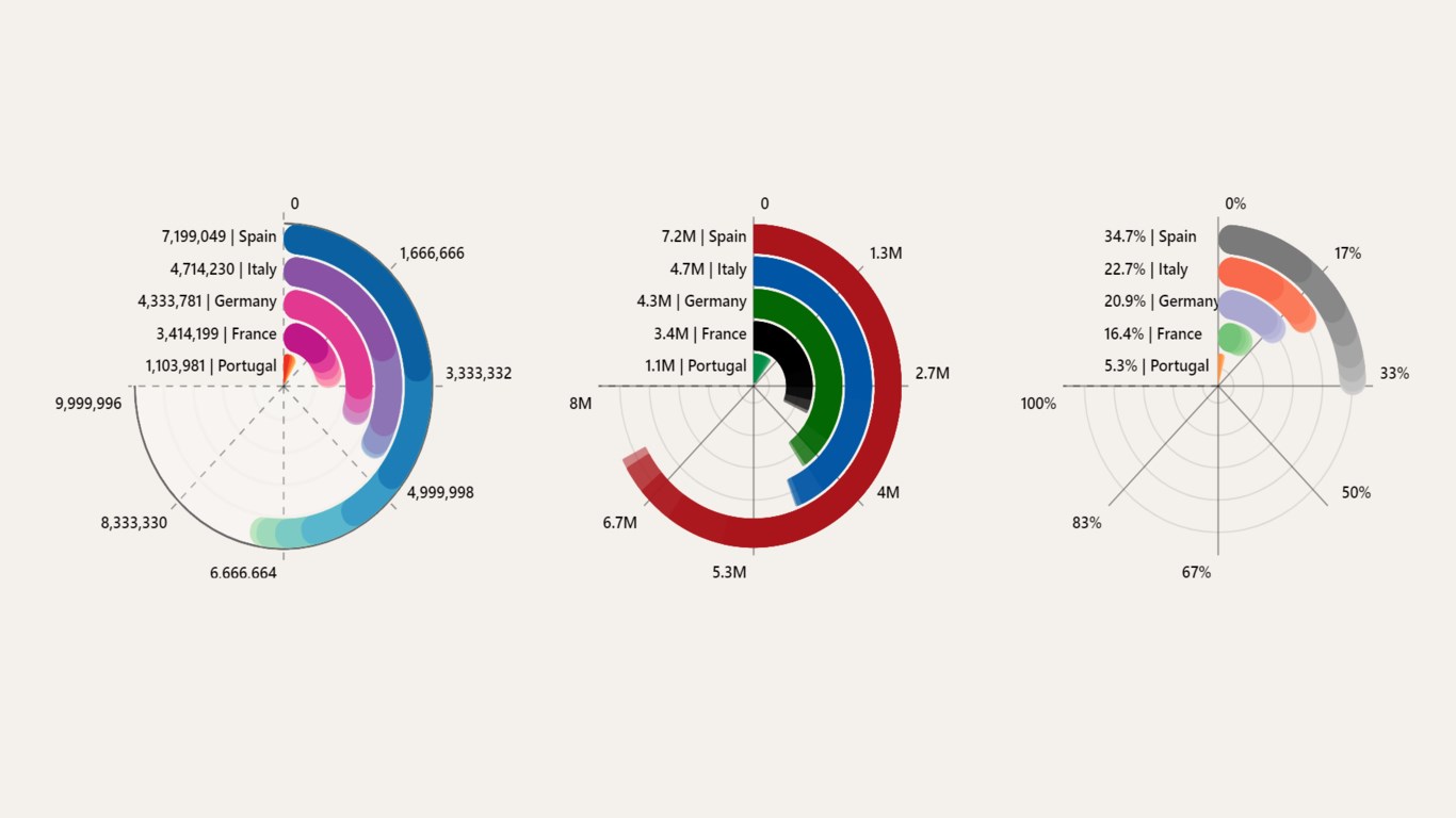
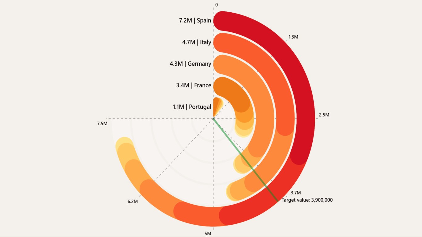
Dynamic Radial Bar Chart by JTA: The Data Scientists combines two of the most effective and common charts in the data visualization field — the bar chart and the radial chart. With multiple configurations available, the visual will allow you to navigate and quickly understand your data.
With a vast range of functionalities and customizing options, you will be able to:
- Drill-down your information to see it in detail
- Define global or individual targets by category to compare it with your data
- Choose between multiple fields when drilling-down
- And much more
If you liked what you saw, you can try it for yourself and find more information here.
If you have any doubts reach out to custom.visuals@thedatascientists.com.
Capacidades visuales
Este objeto visual está certificado por Power BI.
De un vistazo

Other aplicaciones de JTA The Data Scientists
Stacked Bar Chart with Line by JTAJTA The Data ScientistsClustered bar chart with the possibility to stack one of the bars
+1
Applicable to: Power BI visuals
NaN out of 5
Revenue Filter by JTAJTA The Data ScientistsSmarter Revenue Filtering – Designed for Precision and Ease
+1
Applicable to:Power BI visuals
NaN out of 5
Pie of Pie by JTAJTA The Data ScientistsSlice to Spice: Transform your Pie Chart by Clicking! Dive deeper with a click, creating a new pie!
+1
Applicable to:Power BI visuals
NaN out of 5
Table with Custom Headers by JTAJTA The Data ScientistsTransform Your Power BI Tables – Structure, Simplify, Succeed!
+1
Applicable to:Power BI visuals
NaN out of 5
Donut Chart by JTAJTA The Data ScientistsInstantly visualize a clear breakdown of positive, neutral, and negative feedback with Donut Chart!
+1
Applicable to:Power BI visuals
NaN out of 5