
価格 無料

Force-Directed Graph
作成者: Microsoft Corporation
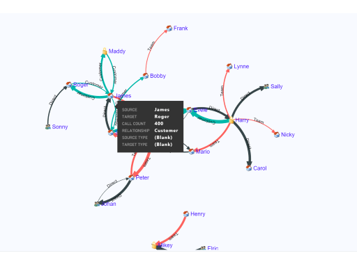
Force layout diagram with curved path. Useful to show connections between entities
The ability to visualize the relationship between items, the weightage of the relationship and the flow often brings out the untold insights into limelight, which are otherwise not very evident. Simple numbers and basic charts won’t be enough to discover and tell such data stories. We need new visualization techniques for the complex world of relationship and Force-Directed Graph thrives to the forefront for such scenarios.
This custom visual implements a D3 force layout diagram with curved paths. The thickness of the path represents the weight of the relationship between the nodes.
Since the relationship and interconnection between large set of entities could be very complex, the visual positions the nodes in such a way that there are few crossings as possible, making the exploration experience easy, fun. The visual also produces the layout which is overall pleasing to the eyes for large data sets. Users can also adjust the layout manually by simply dragging the nodes around.
Ideally you would need two dimensions and one measure (for the weightage) to use with this visual. But this also works just with a single column.
This is an open source visual. Get the code from GitHub: https://github.com/Microsoft/PowerBI-visuals-ForceGraph
ビジュアル機能
このビジュアルは、Power BI によって認定されています
概要

Microsoft Corporation のその他のアプリ


Text FilterMicrosoft Corporation Power BI visualsSearch across your dataset right from the dashboard
Applicable to:Power BI visuals
NaN out of 5

Word CloudMicrosoft CorporationPower BI visualsCreate a fun visual from frequent text in your data
Applicable to:Power BI visuals
NaN out of 5

GanttMicrosoft CorporationPower BI visualsA type of bar chart which illustrates a project timeline or schedule with resources
Applicable to:Power BI visuals
NaN out of 5

Chiclet SlicerMicrosoft CorporationPower BI visualsDisplay image and/or text buttons that act as an in-canvas filter on other visuals
Applicable to:Power BI visuals
NaN out of 5

Sankey ChartMicrosoft CorporationPower BI visualsFlow diagram where the width of the series is proportional to the quantity of the flow
Applicable to:Power BI visuals
NaN out of 5
本製品を取得することで、プロバイダーが本製品および関連製品に関して私に連絡できるように、私のアカウント情報を Microsoft が使用または共有することを許可します。プロバイダーの 使用条件 および プライバシー ポリシー に同意し、Microsoft がプロバイダーである場合を除き、本製品を使用する権利が Microsoft から提供されるものではないことを理解しました。AppSource の使用は、別の 使用条件 および プライバシー に基づいています。