Visualize your data with Scatter Chart with rectangle selection support
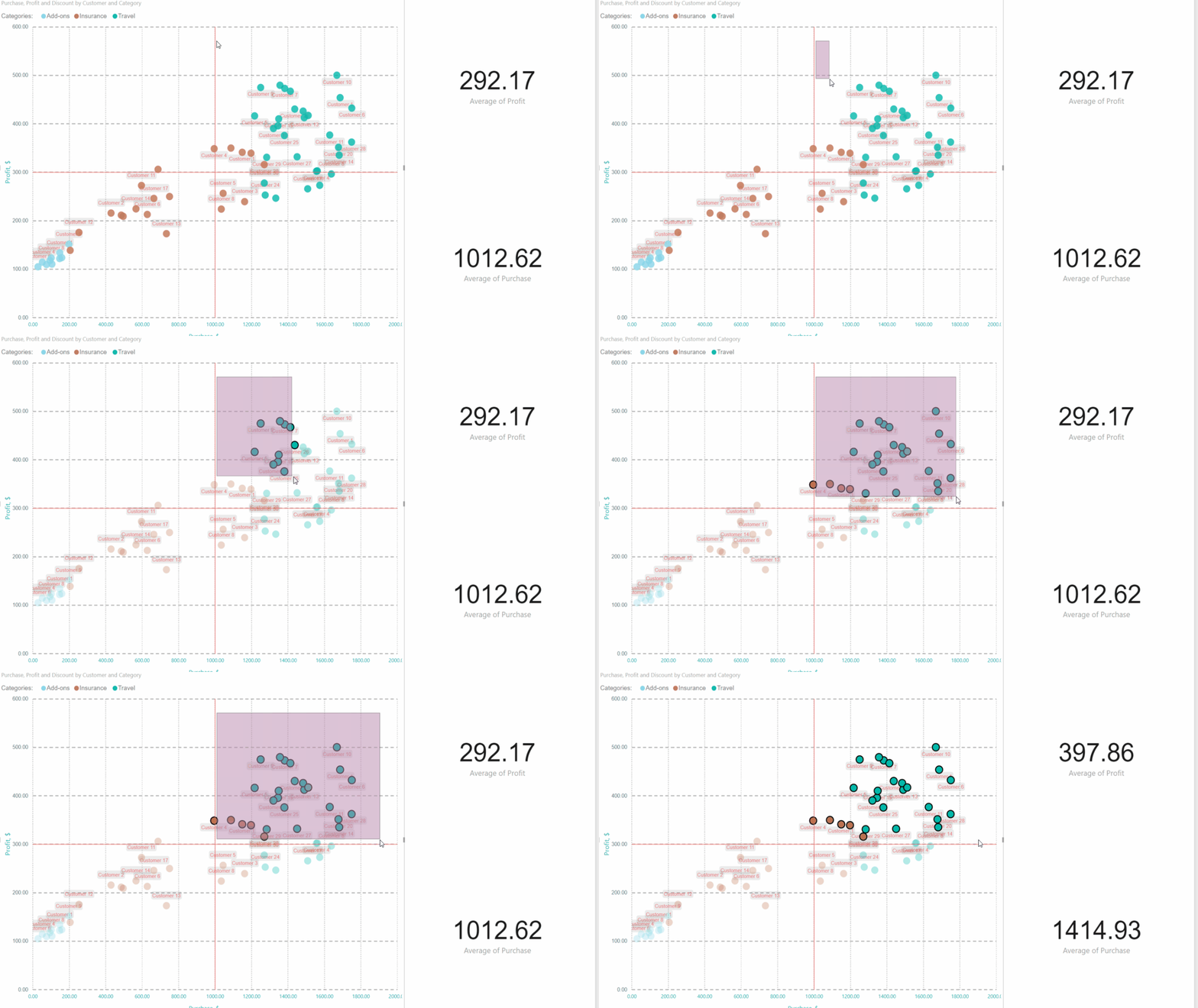
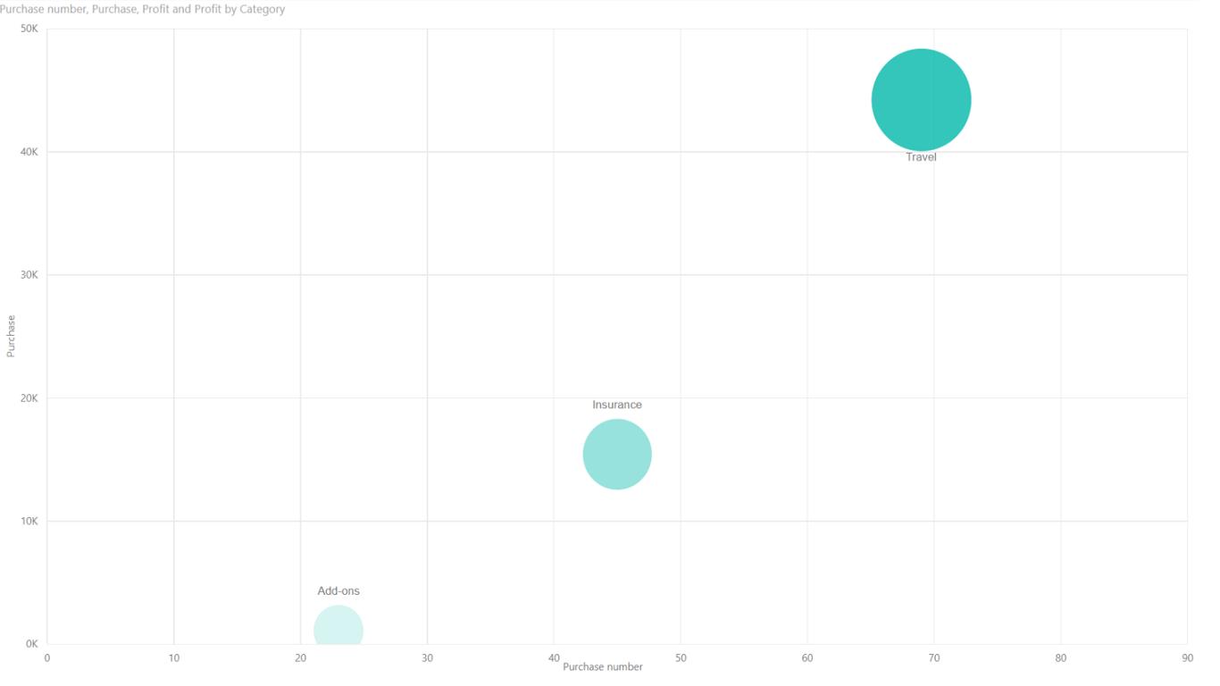
Scatter Chart by Akvelon is similar to other two-dimensional chart visuals and allows you to assess your units using multiple measures - X and Y axes coordinates, point size and saturation. Additionally it supports rectangle selection - such filtering allows to select multiple points of the scatter within rectangle area. This feature will help you to filter specific cluster within your data and update your report to show information about that specific data points.
Other important features are:
- Drill mode to visualize hierarchical data
- X and Y constant lines. Such lines will help to create quadrant charts to assess state of your units, or create specific "good" and "bad" zones and see which points are falling into them.
- Legend that supports selection
- Ability to change colors of the points - you can set specific color for each Legend category
- Ability to change styling of rectangle selection - set transparency of selected and not selected points, color of selection rectangle. You can adjust those according to the styling of your Power BI report.
- Saving current state of the selection
Changes log:
- v.1.2.0: Added "Play Axis" feature
Możliwości wizualizacji
Ta wizualizacja uzyskała certyfikat usługi Power BI
W skrócie


Inne aplikacje z Akvelon
Hierarchy Chart by AkvelonAkvelonShow any type of hierarchical data in a tree format such as organization and family trees
+1
Applicable to: Power BI visuals
NaN out of 5
Custom Calendar by AkvelonAkvelonCustomize how you visualize day-to-day data with this easy to use Custom Calendar
+1
Applicable to: Power BI visuals
NaN out of 5
Bubble Chart by AkvelonAkvelonVisualize your quantitative data easily with Bubble Chart by Akvelon
+1
Applicable to: Power BI visuals
NaN out of 5
100% Stacked Bar Chart by AkvelonAkvelon100% Stacked Bar Chart by Akvelon is enhanced by rectangle selection of bars
+1
Applicable to: Power BI visuals
NaN out of 5
Stacked Column Chart by AkvelonAkvelonStacked Column Chart by Akvelon is enhanced by rectangle selection of bars
+1
Applicable to: Power BI visuals
NaN out of 5