
定价 免费

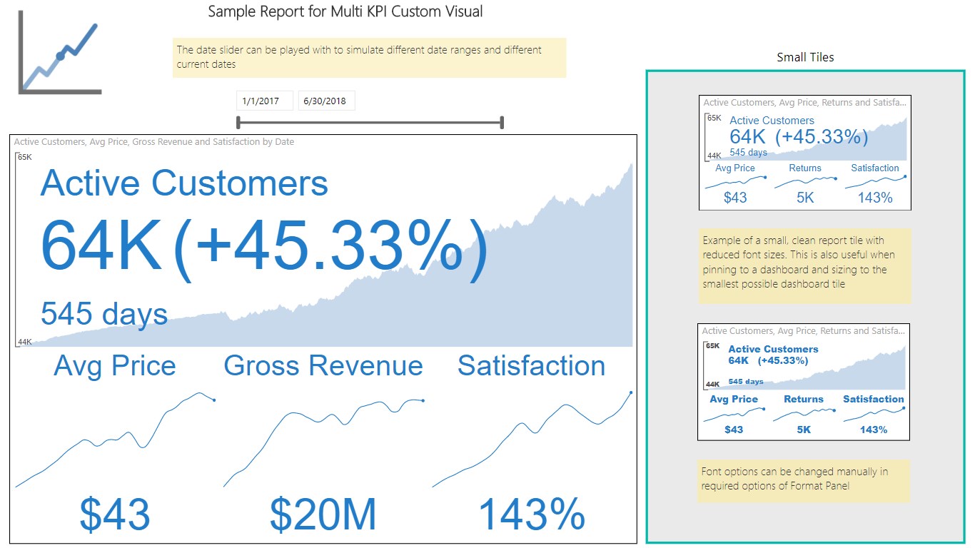
A powerful Multi KPI visualization, of a key KPI along with multiple sparklines of supporting data
The Multi KPI custom visual is for presenting a key performance indicator (KPI) along with a variety of supporting information, including:
- Title, Subtitle
- Sparklines
- Current date and KPI status (value, date, variance)
Some of the key features include:
- KPI trend over time: hover-over the main chart to see a KPI for each date.
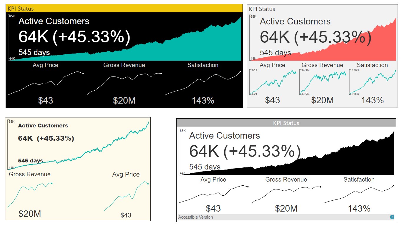
- Rich Formatting Options: set alternate titles, and tooltips, font sizes, colors, background colors.
- Numerous Chart Features: multi KPI support number types, precision, Y-axis tick marks, and hover-over tooltips.
- Sparkline Interpolation: Interpolate sparkline values to get rid of noisy points.
- Auto-Scaling: design a larger tile in your report with rich details. After pinning it to a Power BI Dashboard, you may resize it to smaller versions of the tile without losing essential details.
Download the sample Power BI Desktop file here: https://visuals.azureedge.net/app-store/MultiKpi.multiKpiEA8DA325489E436991F0E411F2D85FF3.1.0.0.0.pbix
视觉对象功能
此视觉对象由 Power BI 认证
概览
来自 Microsoft Corporation 的其他应用


Text FilterMicrosoft Corporation Power BI visualsSearch across your dataset right from the dashboard
Applicable to:Power BI visuals
NaN out of 5

Word CloudMicrosoft CorporationPower BI visualsCreate a fun visual from frequent text in your data
Applicable to:Power BI visuals
NaN out of 5

GanttMicrosoft CorporationPower BI visualsA type of bar chart which illustrates a project timeline or schedule with resources
Applicable to:Power BI visuals
NaN out of 5

Chiclet SlicerMicrosoft CorporationPower BI visualsDisplay image and/or text buttons that act as an in-canvas filter on other visuals
Applicable to:Power BI visuals
NaN out of 5

Sankey ChartMicrosoft CorporationPower BI visualsFlow diagram where the width of the series is proportional to the quantity of the flow
Applicable to:Power BI visuals
NaN out of 5