Comparison Chart image

Comparison Chart

作者 mogular

(1 評分)
下載範例說明

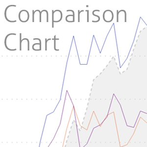
Compare connected information with a reference e.g. individual stocks vs market index

The Comparison Chart is an advanced line chart that allows you to visualize a comparison of connected information:
  • sales of my products vs. market
  • team performance vs. company performance
  • top shares vs. an index
The Comparison Chart allows you to easy and clearly present a comparison between multiple connected data series (like the sales of your different products) with a benchmark like externally acquired market data. Just choose the x-axis from your calendar table, the products to the legend, the measure from your sales table to the values and the measure of your market data to the compare values fields. Choose your own custom colors and styles for the lines, the compare data can also be shown as an area. The legend can be shown in different places. Find the perfect style for your report. You can use the switch next to the legend to toggle the aggregation of all shown category values to a single line. If you would want to compare data in a standard line chart for more than one data series (e.g. your different products) you either need to create measures for each of your products and add them to the values of the line chart or use the product as legend in the line chart and filter only the products you want to see, To compare the individual with benchmark data you are not able to use the legend for your measures. With the Comparison Chart you can have both: A dynamic number of measures (e.g. top 5 products) AND an index for comparison purposes. The free version shows the top 5 values in the free version. More categories are supported in the Pro version. More information on: https://www.comparisonchart.info

視覺效果功能

使用此視覺效果時,其
  • 可存取外部服務或資源
取得此產品即表示我授權 Microsoft 使用或共用我的帳戶資訊,以便提供者可就此產品及相關產品的相關事宜與我連絡。我同意提供者的 使用規定隱私權原則,並了解除非 Microsoft 是提供者,否則此產品的使用權利並非由 Microsoft 提供。使用 AppSource 受到個別的 條款隱私權 所規範。