
Pricing Free

Aster Plot
by Microsoft Corporation
A visually enhanced alternative to the traditional donut chart
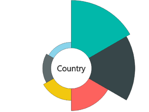
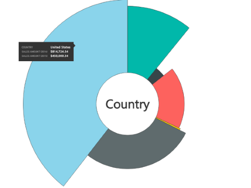
The Aster Plot is a custom visual that combines the familiar look of a donut chart with added analytical depth by incorporating two separate measures. This unique design enables a more nuanced representation of data, making it ideal for comparative analysis and insightful storytelling.
- Category-driven layout: Each slice represents a category from your dataset.
-
Dual-measure capability:
- The first measure determines the radius (depth) of each slice.
- The second measure controls the sweep angle (width).
This dual encoding approach provides a richer, more dynamic way to highlight both magnitude and proportion simultaneously.
Use cases: Ideal for showing performance metrics, weighted distributions, or any data scenario where you want to communicate both value and impact at a glance.
Visual capabilities
This visual is certified by Power BI
At a glance
Other apps from Microsoft Corporation


Text FilterMicrosoft Corporation Power BI visualsSearch across your dataset right from the dashboard
Applicable to:Power BI visuals
NaN out of 5

Word CloudMicrosoft CorporationPower BI visualsCreate a fun visual from frequent text in your data
Applicable to:Power BI visuals
NaN out of 5

GanttMicrosoft CorporationPower BI visualsA type of bar chart which illustrates a project timeline or schedule with resources
Applicable to:Power BI visuals
NaN out of 5

Chiclet SlicerMicrosoft CorporationPower BI visualsDisplay image and/or text buttons that act as an in-canvas filter on other visuals
Applicable to:Power BI visuals
NaN out of 5

Radar ChartMicrosoft CorporationPower BI visualsMultiple measures plotted over a categorical axis. Useful to compare attributes
Applicable to:Power BI visuals
NaN out of 5
By getting this product, I give Microsoft permission to use or share my account information so that the provider can contact me regarding this product and related products. I agree to the provider's terms of use and privacy policy and understand that the rights to use this product do not come from Microsoft, unless Microsoft is the provider. Use of terms is governed by separate privacy and {4}.