Pricing Free
时勤Echart-Boxplot_Light_Velocity
by 上海时勤信息科技有限公司
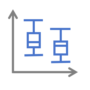
Box plot is a very practical data visualization tool that can quickly provide an overview of data.
Product Name: Power BI Box Visualization Object
Version: 1.0.0
Release date: December 5th, 2024
Developer: [Infortime Shiqin]
Product Description:
This product is an advanced visualization object designed specifically for Power BI users, utilizing advanced data visualization technology to provide users with an intuitive and interactive way to display boxplots. This object not only supports basic box whisker display, but also provides rich customization options, including but not limited to data labels, legends, tooltips, and various interactive functions.
Main functions:
1. Data driven visualization: Users can directly drive the boxplot through the data model of Power BI to achieve dynamic data display.
2. Highly customizable: Provides multiple customization options, including color, font, legend position, etc., to meet the display needs of different users.
3. Interactivity: Supports interactive operations such as clicking and hovering, enhancing user experience.
4. Responsive design: Boxu graphics can adapt to different display devices and resolutions.
5. Multi language support: Supports multiple languages to meet the needs of global users.
6. Quartile display: Clearly display the minimum value, first quartile (Q1), median (Q2), third quartile (Q3), and maximum value of the data.
7. Outlier recognition: Automatically mark and display outliers in the data to help users identify outliers.
8. Multi dataset comparison: Supports displaying boxplots of multiple datasets simultaneously, making it easier to compare the distribution of different datasets.
9. Interactive tool tip: Provides detailed data information when the user hovers over a specific data point or area.
Visual capabilities
When this visual is used, it
- Can access external services or resources
Other apps from 上海时勤信息科技有限公司
时勤-Calendar1上海时勤信息科技有限公司 Power BI visualsThis product is an advanced visualization object designed for Power BI users to provide an intuitive
Applicable to:Power BI visuals
NaN out of 5
时勤Echart-Basic_Sankey上海时勤信息科技有限公司Power BI visualsSankey chart is a special type of chart used to display the distribution of data, particularly suita
Applicable to:Power BI visuals
NaN out of 5
时勤Echart-Bar上海时勤信息科技有限公司Power BI visualsThis product is an advanced visualization object designed specifically for Power BI users, leveragin
Applicable to:Power BI visuals
NaN out of 5
时勤Echart-Card上海时勤信息科技有限公司Power BI visualsThis product is an advanced card style data visualization object tailored for Power BI users, aiming
Applicable to:Power BI visuals
NaN out of 5
时勤Echart-Bar_Chart_with_Negative_Value上海时勤信息科技有限公司Power BI visualsThis product is an advanced visualization object designed specifically for Power BI users, utilizing
Applicable to:Power BI visuals
NaN out of 5
By getting this product, I give Microsoft permission to use or share my account information so that the provider can contact me regarding this product and related products. I agree to the provider's terms of use and privacy policy and understand that the rights to use this product do not come from Microsoft, unless Microsoft is the provider. Use of terms is governed by separate privacy and {4}.