
Pricing Free

Cumulative by sio2Graphs
by sio2Graphs
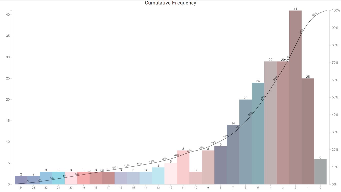
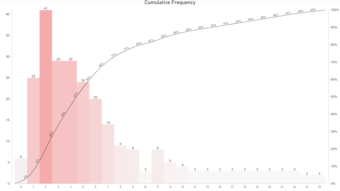
Plot frequency against categorical or grouped data, creating a cumulative frequency distribution.
“Cumulative by sio2Graphs” was designed to be quick and easy!
Hundreds of categories, no problem. Make it your own with a wide array of customizations.
Present your data without the use of high maintenance measures or complicated DAX formulas. Even a small number of measures can become cumbersome.
Cumulative frequency can help businesses understand the percentage a metric of interest is occurring at or less than at point x. This can help to set quality limits, track where resources are needed, plan for improvements, or use as a learning and marketing tool.
Plot cumulative frequency on the y-Axis against time or categorical boundaries on the x-Axis, creating a cumulative frequency distribution. Frequency is the number of times an event or outcome occurs. Distribution is how frequency is spread over categories, boundaries or time. The cumulative or relative frequency at point x is the sum of individual frequencies up to and at point x.
Customizations
- Fonts, colors and sizes
- Scrolling and resizing
- Label placement and editing
- Text hovering to increase readability
- Value & currency formatting
- Thinning arc percentage labels
- Multiple coloring options
- Value placement
- Localizations
- 1-Click formatting
- Highlighting the process drivers
- Display and highlight the Mean
- cynthia@sio2graphs.com
- https://appsource.microsoft.com/en-us/product/power-bi-visuals/WA200001423?tab=Reviews
Visual capabilities
This visual is certified by Power BI
At a glance
Other apps from sio2Graphs

Pareto by sio2Graphssio2Graphs Power BI visualsClearly visualize which factors are having the greatest impact and driving business processes.
Applicable to:Power BI visuals
NaN out of 3
verticalText by sio2Graphssio2GraphsPower BI visualsPlace text vertically on visual to use as a Header for a logotype or title.
Applicable to:Power BI visuals
NaN out of 3
Pareto+sio2GraphsPower BI visualsClearly visualize the leading factors driving any business process.
Applicable to:Power BI visuals
NaN out of 3
By getting this product, I give Microsoft permission to use or share my account information so that the provider can contact me regarding this product and related products. I agree to the provider's terms of use and privacy policy and understand that the rights to use this product do not come from Microsoft, unless Microsoft is the provider. Use of terms is governed by separate privacy and {4}.