Pricing Free
3AG Systems - Line chart with absolute variance
by 3AG Systems
Automatically calculates absolute variance and displays data in a line chart with the variance on to
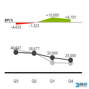
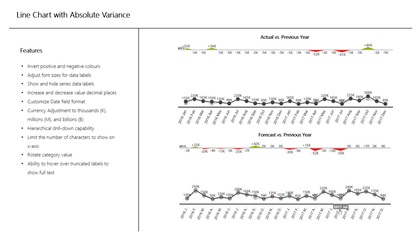
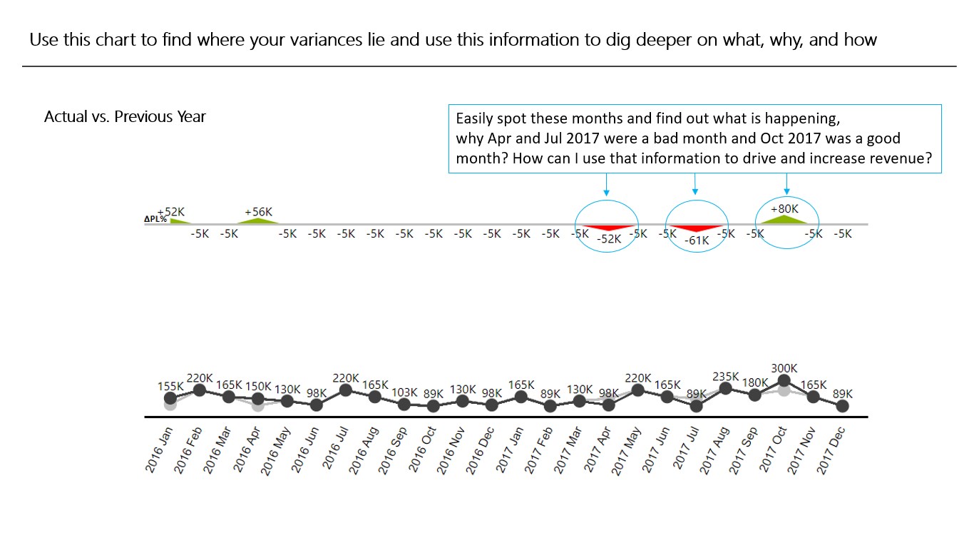
Line Chart with Absolute Variance takes two datasets and automatically calculates the absolute variance between the two data. It plots the two datasets in a line chart and shows absolute variance on top of the line for each category. The visualization is influenced by the International Business Communication Standards (IBCS) where colors red and green are used to flag the bad and good indicators respectively.
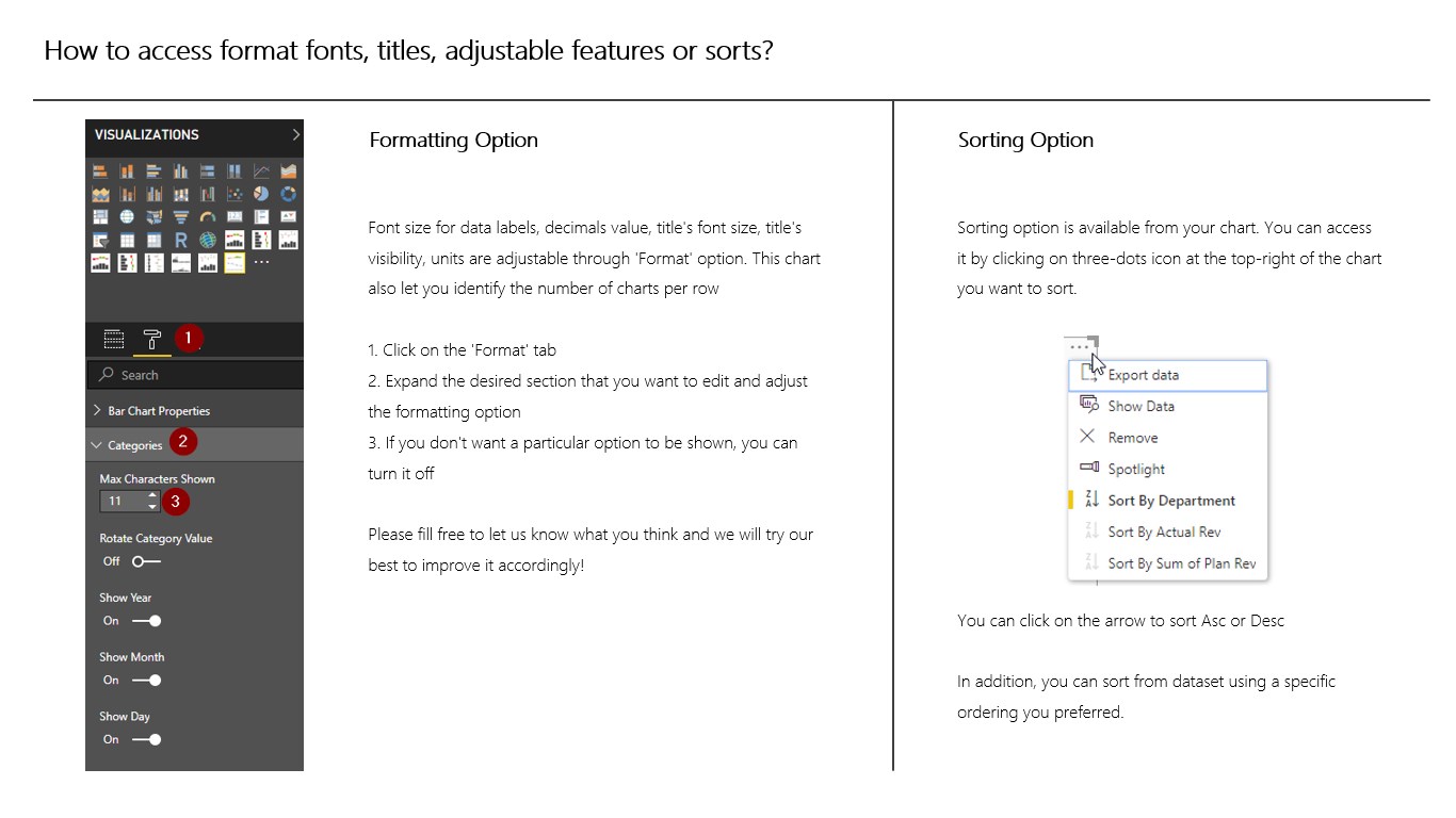
Customization options include: inversing the colors for red and green; resizing the data label font sizes; hiding data labels; increasing or decreasing decimal places; adjusting value to thousands (K), millions (M), and billions (B); drilling-down hierarchical data; adjusting number of characters to show on x-axis labels ; rotating x-axis labels for clarity; hovering capability to show full text for truncated x-axis labels and more.
This chart is useful to compare “Actual vs. Planned”, “Actual vs. Previous Year”, “Forecast vs. Planned”, and “Forecast vs. Previous Year” data.
Visual capabilities
When this visual is used, it
- Can access external services or resources
At a glance
Other apps from 3AG Systems

3AG Systems - Bar Chart With Relative Variance3AG Systems Power BI visualsCalculates percentage change and displays an overlapped bar chart with lollipop variance
Applicable to:Power BI visuals
NaN out of 5
3AG Systems - OEE Dashboard3AG SystemsPower BI visualsDisplay OEE and constituent components for any number of machines in a factory
Applicable to:Power BI visuals
NaN out of 5
3AG Systems - Column Chart with Variance3AG SystemsPower BI visualsThis chart allows you to use two datasets to generate an overlapping column chart with variance.
Applicable to:Power BI visuals
NaN out of 5
3AG Systems - Bar Chart With Absolute Variance3AG SystemsPower BI visualsAutomatically calculates absolute variance and displays an overlapped bar chart with the variance
Applicable to:Power BI visuals
NaN out of 5
3AG Systems - Column Chart With Relative Variance3AG SystemsPower BI visualsCalculates percentage change and displays an overlapped column chart with lollipop variance
Applicable to:Power BI visuals
NaN out of 5
By getting this product, I give Microsoft permission to use or share my account information so that the provider can contact me regarding this product and related products. I agree to the provider's terms of use and privacy policy and understand that the rights to use this product do not come from Microsoft, unless Microsoft is the provider. Use of terms is governed by separate privacy and {4}.