Tarification Gratuit

D3.js Visual - create your own custom visual
par DataScenarios
Bring your data to life by using HTML, SVG, CSS via the D3.js framework and create your own visual.
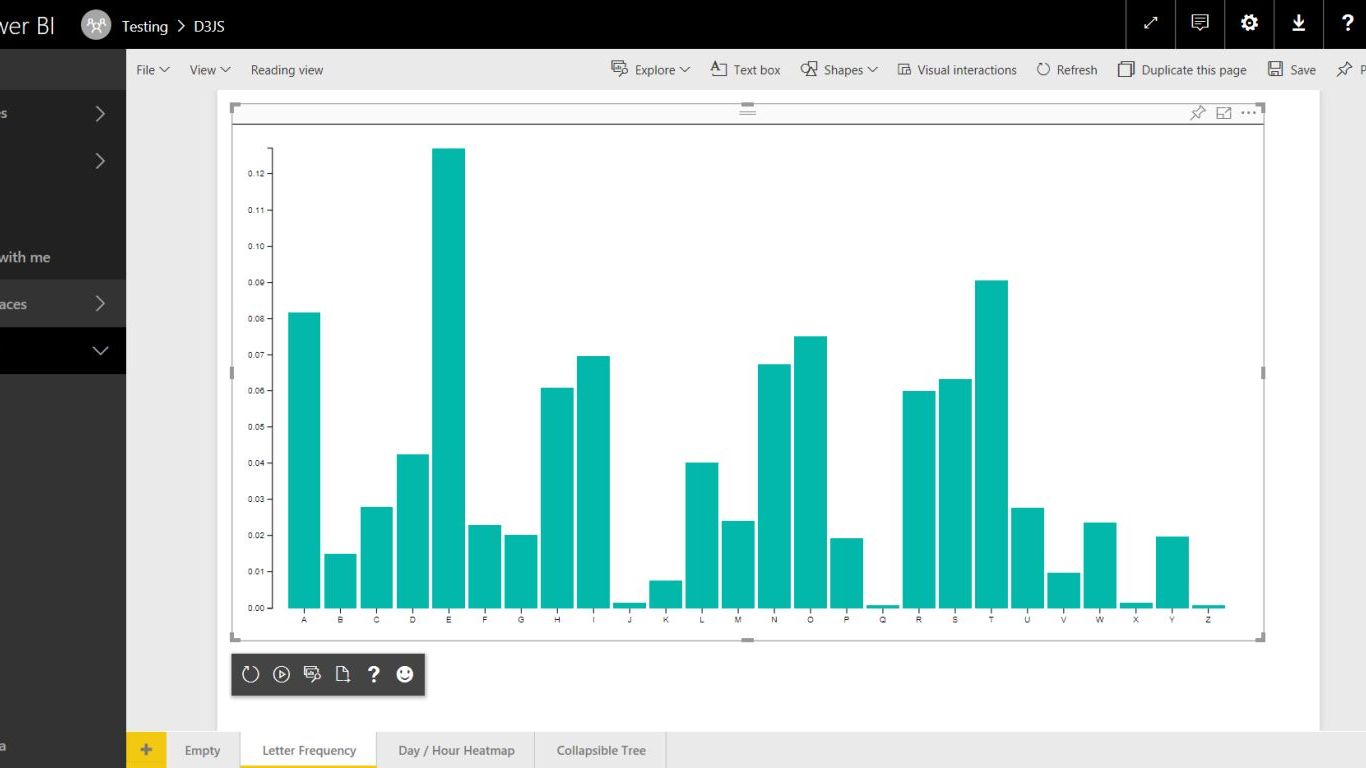
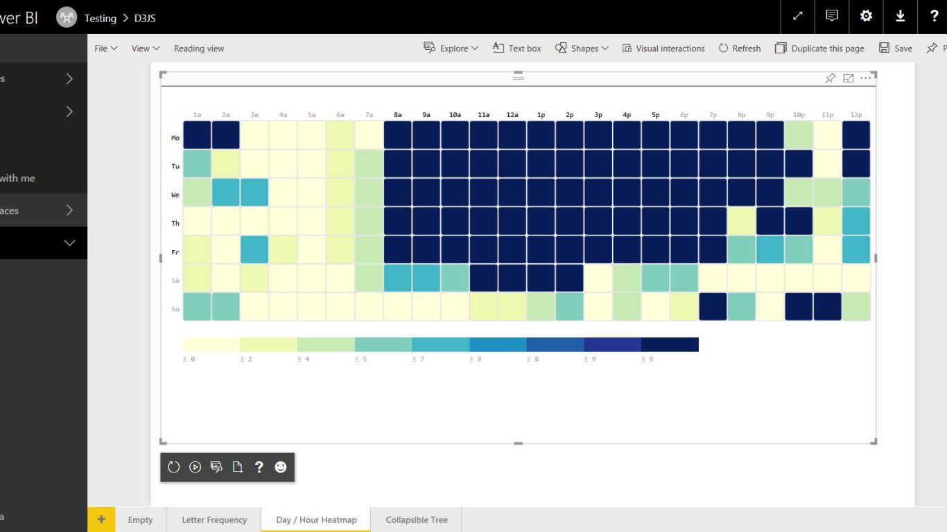
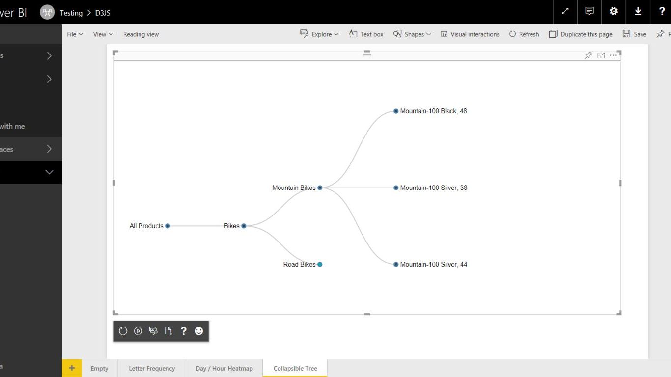
The D3.js Visual for Power BI provides a D3.js skeleton visual that everybody can use to create custom visuals with D3.js. Either the visual can be created from scratch or an existing D3.js visual can be used via a seamless 'lift-and-shift' procedure.
Some alterations are need to get the correct dimensions and the data retrieval. Optional it is possible to alter the color assignment based on the provided color array. A short tutorial can be found at: https://azurebi.jppp.org/power-bi-d3js-visual/
All D3.js visuals run in a frame with the following elements/variables:
SVG element:
- svg xmlns="http://www.w3.org/2000/svg" class="chart" id="chart"
pbi object:
- dsv : function that retrieves the data via the provided callback: pbi.dsv(callback) e.g. pbi.csv(function(data) { //Process data function });
- height : height of the sandbox frame
- width : width of the sandbox frame
- colors : color array with 8 colors; changable via options
Limitations
- D3.js version is v3.5.17
- Maximum amount of datapoints is: 30,000
Release Notes
[1.2.0.0]
- Added several confirmation prompts
- Fixed that the editor is incorrect set to 'readonly'
[1.1.0.0]
- First release to the Office Store
This is an open source visual. Code is available at my GitHub: https://github.com/liprec/powerbi-d3jsvisual
- Jan Pieter Posthuma, DataScenarios
Fonctionnalités visuelles
Quand ce visuel est utilisé, il
- Peut accéder aux services ou ressources externes
Vue d’ensemble
Autres applications de DataScenarios

HierarchySlicerDataScenarios Power BI visualsCreate a hierarchy of different fields and use it as a slicer with Power BI.
Applicable to:Power BI visuals
NaN out of 3
Box and Whisker chartDataScenariosPower BI visualsVisualize a dataset in an effective way as a five-number summary (mean, median, quartiles, min/max)
Applicable to:Power BI visuals
NaN out of 3
Event ViewerDataScenariosPower BI visualsThe Event Viewer chart visualizes device events over time. Ideal for IoT devices that report states.
Applicable to:Power BI visuals
NaN out of 3
En obtenant ce produit, je donne à Microsoft l’autorisation d’utiliser ou de partager les informations de mon compte afin que le fournisseur puisse me contacter concernant ce produit et les produits associés. J’accepte les conditions d'utilisation et la politique de confidentialité du fournisseur et je comprends que les droits d’utilisation de ce produit ne proviennent pas de Microsoft, sauf si Microsoft est le fournisseur. L’utilisation d’AppSource est régie par des termes et des confidentialité distincts.