
Tarification Gratuit
Control Chart
par Nova Silva
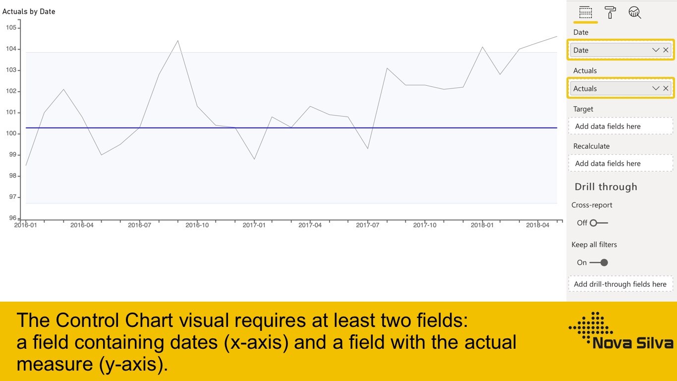
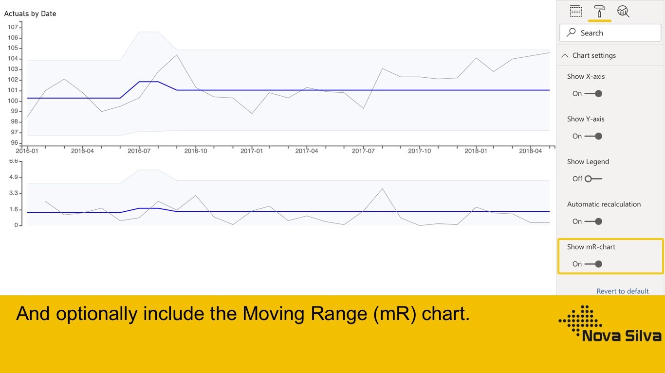
The most useful way to see true signals of change in your KPI is to use a ControlChart (XmR chart)
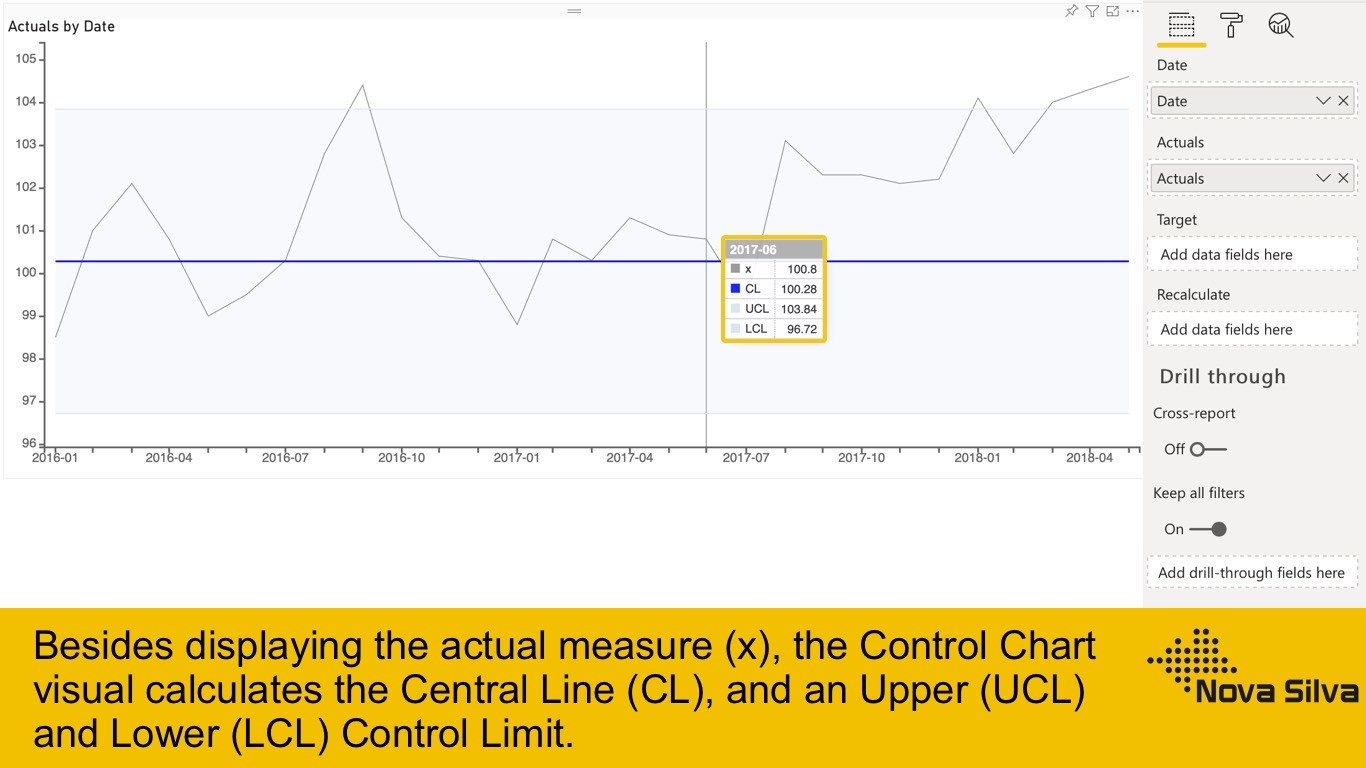
The ControlChart chart is actually two charts. The X is the data point being measured and mR the Moving Range which is the difference between consecutive data point measurements.
The upper chart (X-Chart) displays the data-points over time (Actuals) together with a calculated average (Average - center-line (CL)). The calculated average is then used to calculate the Upper and Lower Control Limits. The lower chart displays the Moving Range (mR-Chart) with its Average and Upper Control Limit. There is no lower control limit as the value of the difference between consecutive actual-values is recorded as an Absolute Value (positive number).
In this custom visual you can hide the lower chart (mR-Chart).
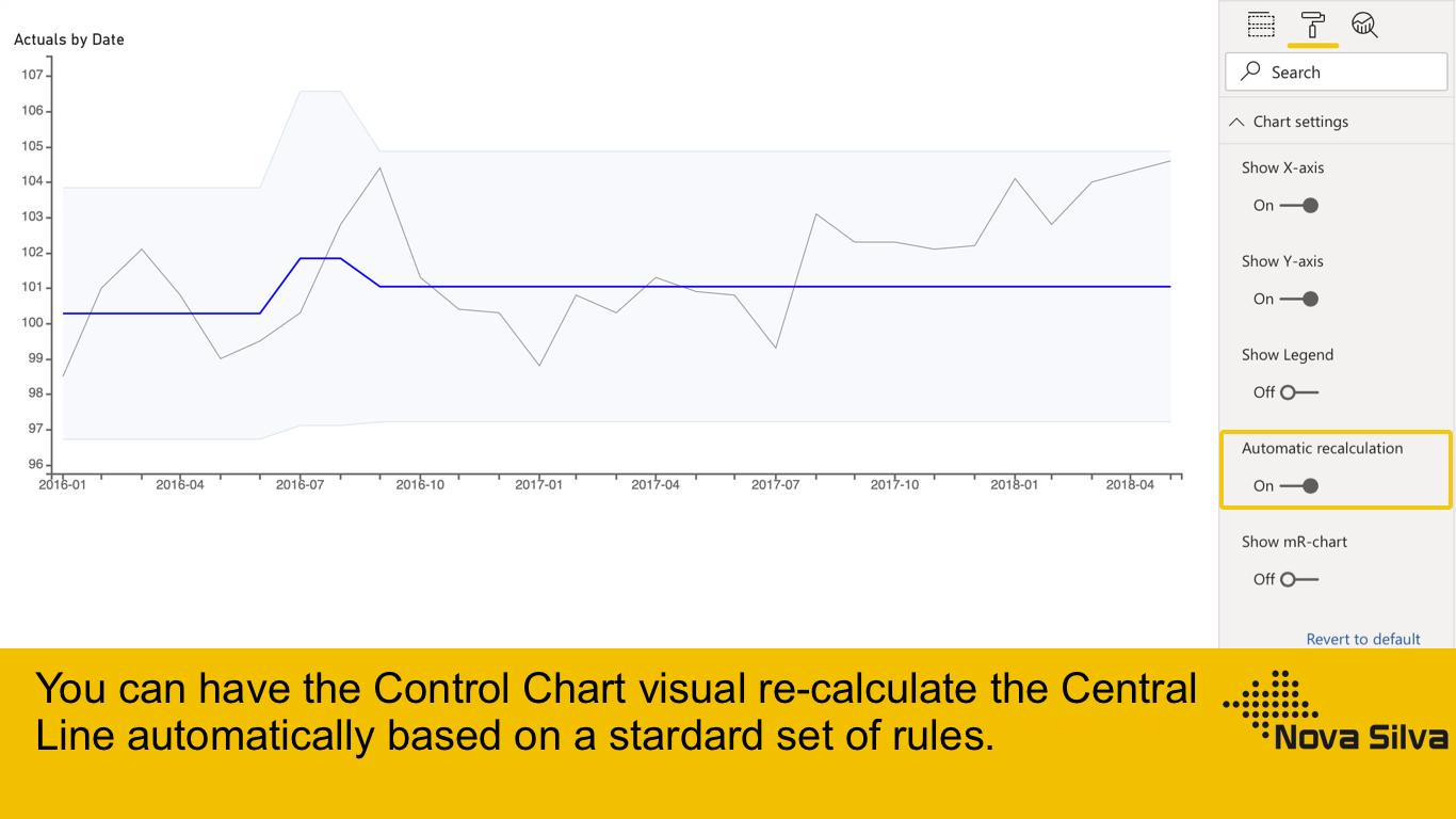
The calculation of the charts can set to Automatic in this visual. The rules being used for the automatic recalculation are:
- 7 points in a row are above or below the center-line
- 10 out of 12 points are above or below the center-line
- 3 out of 4 points are closer to the UCL or LCL than the center-line
You also can add a data-value that enables manual calculation. The charts will be recalculated at the date-value where the value is set to 1. Need more information? Visit our site at: https://visuals.novasilva.com
Fonctionnalités visuelles
Ce visuel est certifié par Power BI
Vue d’ensemble
Autres applications de Nova Silva

PowerGantt ChartNova Silva Power BI visualsPowerful insight into your planning and milestone performance
Applicable to:Power BI visuals
NaN out of 5

Shielded HTML ViewerNova SilvaPower BI visualsVisualize your HTML formatted content to add valuable context to your figures.
Applicable to:Power BI visuals
NaN out of 5

SMART KPI ListNova SilvaPower BI visualsIncrease the power of your KPI’s by adding context with the SMART KPI List
Applicable to:Power BI visuals
NaN out of 5

Milestone Trend Analysis ChartNova SilvaPower BI visualsEffectively manage multiple projects and track their progress with valuable visual insights
Applicable to:Power BI visuals
NaN out of 5

Dumbbell Bar ChartNova SilvaPower BI visualsUnleash the power of comparison with the Dumbbell Bar Chart
Applicable to:Power BI visuals
NaN out of 5
En obtenant ce produit, je donne à Microsoft l’autorisation d’utiliser ou de partager les informations de mon compte afin que le fournisseur puisse me contacter concernant ce produit et les produits associés. J’accepte les conditions d'utilisation et la politique de confidentialité du fournisseur et je comprends que les droits d’utilisation de ce produit ne proviennent pas de Microsoft, sauf si Microsoft est le fournisseur. L’utilisation d’AppSource est régie par des termes et des confidentialité distincts.