ChartExpo™ for Excel
av polyvista.com
Select a chart, select your data, and create Insightful charts without hardwork!
Simply Powerful:
ChartExpo is a data visualization add-in for Microsoft Excel that simplifies creating impactful charts from spreadsheets. It allows users to generate various custom visualizations, like network diagrams, flowcharts and comparison charts, and integrates seamlessly with Excel.
Overwhelmed With Data, Starving For Insight:
Data is useless without insights, and ChartExpo Excel charts can simplify the analysis process. Spreadsheets organize data, intuitive charts help to bridge the gap and uncover valuable insights.
Accessible Insights:
Manually analyzing data is time-consuming, but ChartExpo data visualization tool simplifies it with an easy, three-click process. This Excel graph maker gives you quick access to valuable insights through a big library of visualizations.
Learn The Language Of Data Using Excel Charts:
ChartExpo’s Excel add-in transforms spreadsheet data into clear visual insights, saving time and improving decision-making. Tools like dashboards and responsive charts boost business growth through effective data analysis.
Make Competitive Decisions with Advance Excel Charts:
Import competitor analysis data in Excel and discover actionable insights at a glance and accelerate your decision making and problem solving with visualizations. Become your competitors’ biggest threat with predictive analytics faster, while they waste time and energy with manual analysis.
Find The Unexpected:
Charting libraries like ChartExpo Excel charts help you cut through noise of chaotic data sets, you uncover new trends, relationships and patterns. It has ready-to-use machine learning and (NLP) natural language processing (sentiment) charts to provide pertinent insights like any other self-service analytics platforms.
Share and Publish Excel Charts:
• Download dataviz as PNG, SVG, PDF and JPG
• Embed chart templates and reporting templates in blogs or websites
• Post on social media
• Create presentations, dashboards & Reports from charts and dynamic graphs
Custom Excel Charts with Ease:
ChartExpo for Excel offers customizable chart designs with adjustable colors, fonts, and styles, simplifying visual report creation for business users. It integrates easily with PowerPoint and Google Slides for interactive presentations, making it a user-friendly alternative to d3 charts.
Enhanced Data Visualization Capabilities:
ChartExpo’s Excel add-on simplifies data visualization with clear, actionable insights for surveys, revenue analytics, SWOT analysis, and more. It helps users create precise charts to support strategic decisions.
Advanced Survey and Reporting Tools:
ChartExpo for Excel offers advance charts to visualize your survey data.
Customizable Visualizations for Any Need:
Whether performing sensitivity analysis, creating conversion metrics Chart, visualizing customer effort score and cost breakdown, ChartExpo offers intuitive interface for creating bespoke visualizations. Ideal for data analysts, and marketing teams looking to make data-driven decisions (data democratization) quickly.
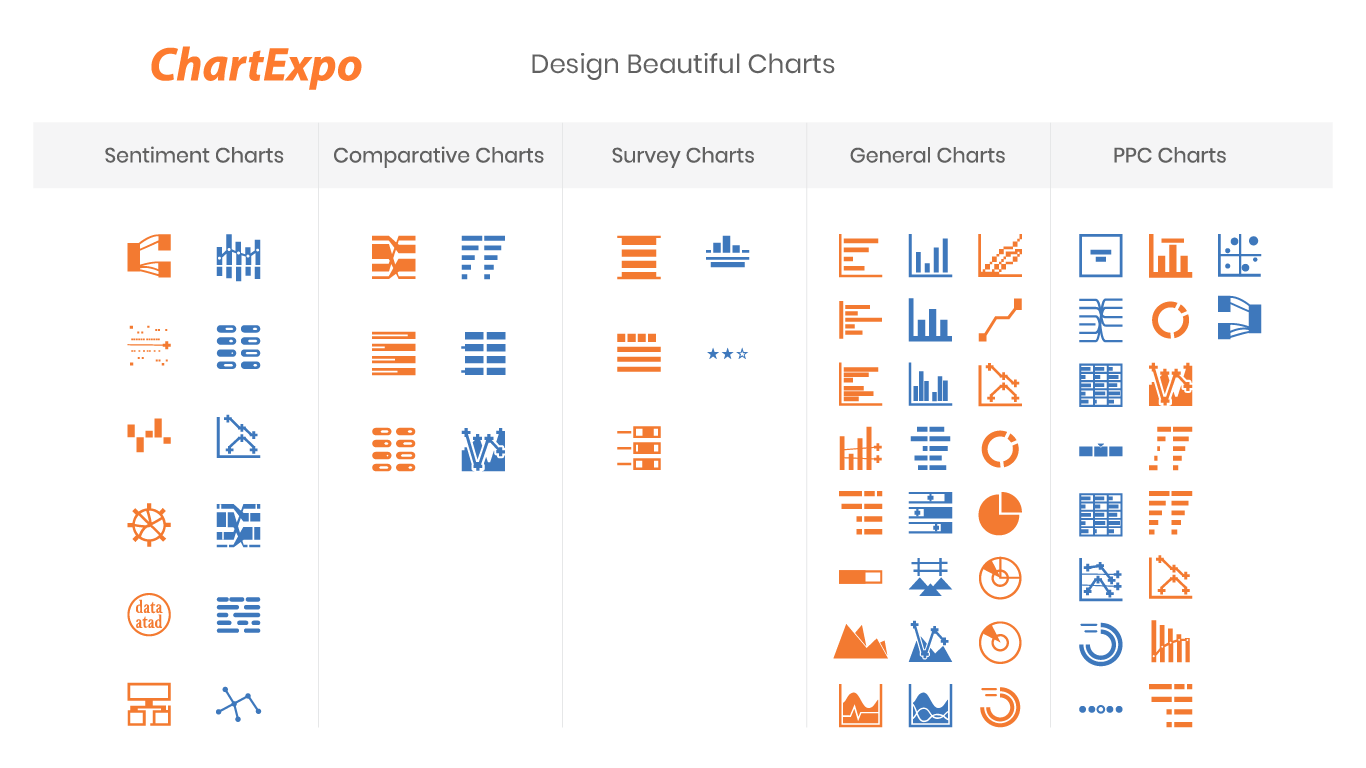
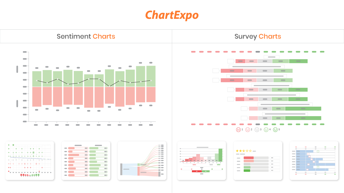
ChartExpo for Excel Supported Charts Types:
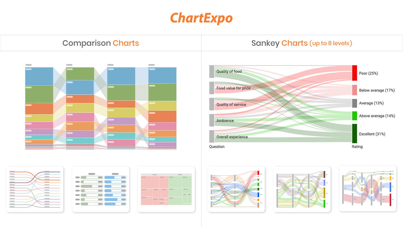
1. Sankey Diagram (Sankey Chart)
3. Likert Scale Chart (5 Point Likert Scale Chart)
4. Gauge Chart (Needle Chart, Speedometer Chart)
6. Waterfall Chart (Bridge Chart, Cascade Chart, Stacked Waterfall Chart)
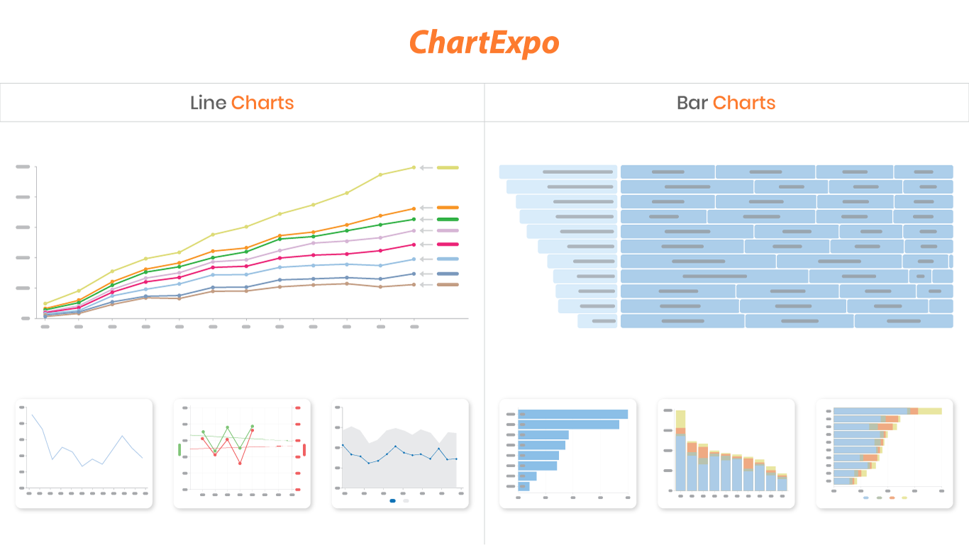
7. Multi axis/Vertical Axis Line Chart
8. Clustered Stacked Column Chart
11. Circular Charts
13. Tree Diagram
14. Sunburst Chart
15. Scatter Plot (XY Graph, Correlation Scatter Plot)
16. Slope Chart (Slope graphs, Bump Chart)
17. Box and Whisker Plot (Box Plot)
18. Tornado Chart (Side by side Bar Chart)
19. Double Bar Graph (Pyramid Chart, Butterfly Chart, Demographic Charts)
20. Stacked Gauge Chart
21. Multi Gauge Chart
22. Histogram
23. Expansion Funnel Chart
24. Clustered Stacked Bar Chart
25. Horizontal Waterfall Chart
26. Mosaic Plot (Mekko Chart)
27. Heatmap (Fulfill dual purpose like Waffle Chart)
28. Funnel Chart (Conversion Funnel)
29. Progress Chart
30. Sentiment Trend Chart
31. Crosstab Chart
32. Performance Bar Chart
33. Overlapping Bar Chart
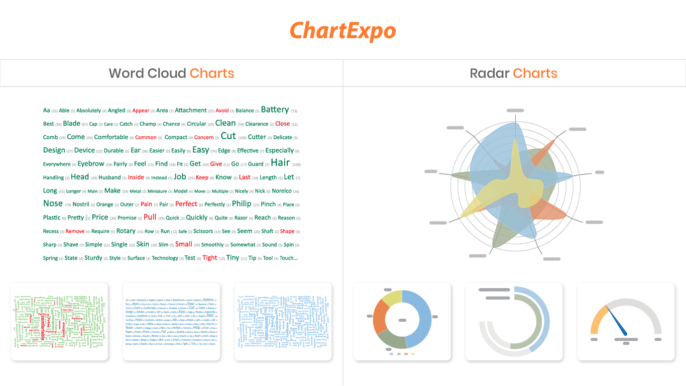
34. Spider Chart
35. Polar Chart
36. Radial Chart (Circular Bar Chart)
37. Treemap Chart (Tree Map Chart)
38. Radar Chart
39. Pareto Chart
40. Chord Diagram
41. Control Chart (U Chart, Run Chart)
42. Ordered Squares Chart (Proportion Chart)
43. Dot Plot
44. Dot Chart (ORA, Visualization for Gene Set Enrichment Analysis)
45. Map Charts (Geo Charts)
46. Bar Charts
47. Stacked Bar Chart
48. Grouped Bar Chart (Clustered Bar Chart)
49. Grouped Column Chart (Velocity Chart, Clustered Column Chart)
50. Stacked Column Chart
51. Line Graphs
52. Multi Series Line Chart (Burndown Chart)
53. Double Axis Line and Bar Chart (Combo Chart, Combination Chart)
54. Pie and Donut Charts (Opportunity Charts, Ratio Chart)
55. Comparison Charts
56. Matrix Chart (Grid Chart)
57. Area Charts
58. Stacked Area Chart
59. Sparkline Chart
60. Star Rating Chart
61. CSAT Survey Bar Chart (NPS Chart)
62. Word Cloud and Tag Cloud
63. Co-Occurrence Chart
64. CSAT Survey Chart (NPS Detail Chart)
65. Customer Satisfaction Chart
66. Quality Score Chart (Ranking Chart)
67. Customer Journey Flow (Sankey Diagram)
68. Energy Flow Diagram (Sankey Diagram)
69. Energy Flow Charts (Sankey Diagram)
70. Solar Energy Diagram (Sankey Diagram)
71. Wind Energy Diagram (Sankey Diagram)
72. Nuclear Energy Diagram (Sankey Diagram)
73. Customer Journey Map (Sankey Diagram)
74. Context Diagram (Force Directed Graph)
75. Text Relationship Chart
76. Credit Score Chart
77. Sequence Chart
78. Components Trend Chart
Tags:
3-axis graphs, annual financial reports, comparing two sets of data, net promoter score, trendlines, funds flow diagrams, renewable energy charts, trend analysis, multi-dimensional graphs, financial statement analysis, variance charts, year-over-year comparisons, sales pipelines, budget template tracking, workforce analytics, time-series graphs, exponential growth charts, chart examples, analyze balance sheet, expense report template, income statement template, weekly reports, financial analysis, KPI Graphs, Profit and Loss Statements, project status reports, Monthly Budgets, Task Tracking, Cost analysis, call center KPIs, metrics and KPIs, incident reports, advanced data analysis, market basket analysis, churn rate analysis, path analysis, Office 365 live charts, useful charts, management reports, data science projects, insightful visualizations, colorful charts, awesome charts, exploratory data analysis, Univariate analysis, statistic measures (minimum, quartiles, percentiles, mean, median, maximum, standard deviation and outliers), multivariate analysis, regression analysis, linear regression model, root cause analysis, popular charts, interactive charts for Crypto, Sales (actual vs target) Charting, Microsoft Forms, advanced survey charts, business reports, visual graphics, pictographs, data widgets, dashboards ,modern charts, types of data charts, statistical graphs, smart visualizations , graphing data, Google Forms, SurveyMonkey, Typeform, Qualtrics, financial portfolio, decision KPIs, ROI, NPV, revenues, expenses, forecast reporting, actual vs planned, rich charts, Power BI , Tableau, employee engagement surveys, response bias, social desirability bias, acquiescence bias, ad hoc reporting, scenario analysis. brand loyalty charts, market basket analyses, PowerPoint presentations, Excel charts and graphs, Simple chart or graph, chart images, Sentiment graphs, survey graphs, feedback charts, customer support charts, customer experience charts, PPC charts , chart maker, advanced analytics, finance charts, good charts, cool Excel charts , data interpretation, visual information, Excel charts on web, Business Intelligence (BI), visual storytelling, production system, daily reports, monthly reports, graphic reports, analytical graphs.
Choose the plan that best suits your needs:
Small businesses and enterprise users who require advanced customized visualizations in Excel can choose the plan that best suits their needs.
• Free Trial: Try for 7 days without a credit card.
• Monthly Plan: $10 per user per month.
• Yearly Plan: $120 per user per year.
Sign-in options for users:
• Sign-in with Microsoft account
• Sign-in with Google account
• Sign-in with email (any valid email account)
Support:
Contact us: https://chartexpo.com/home/contact
Email: support@chartexpo.com
How-To Videos at a Glance:
How to install ChartExpo for Excel?
How to deploy ChartExpo for Excel in Office 365 admin center?
Subscribe to our YouTube Channel for more videos.
Appfunksjoner
- Kan lese og gjøre endringer i dokumentet ditt
- Kan sende data over Internett
Rask oversikt