Cennik Bezpłatnie
Heatmap
firmy Weiwei Cui
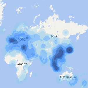
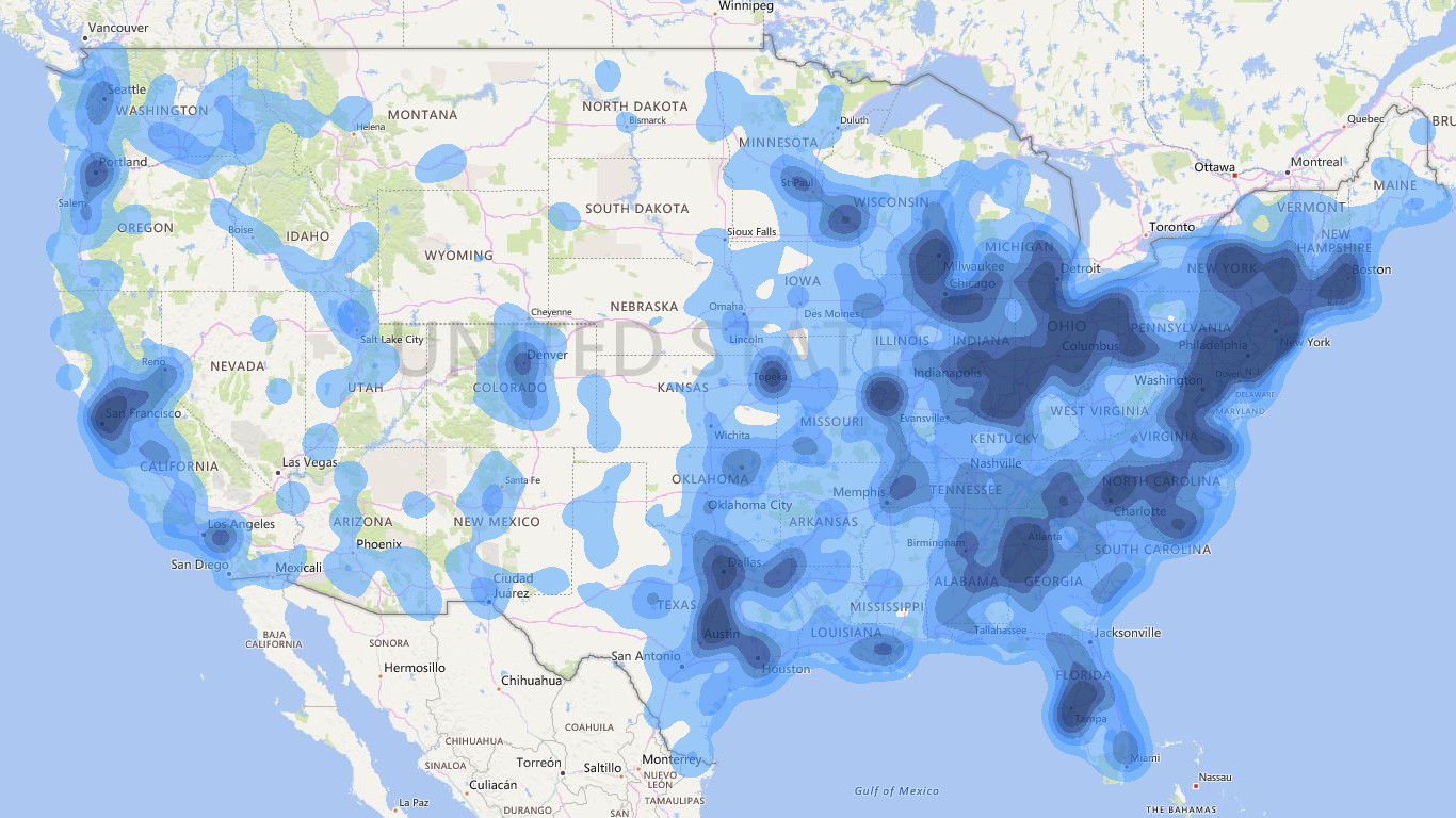
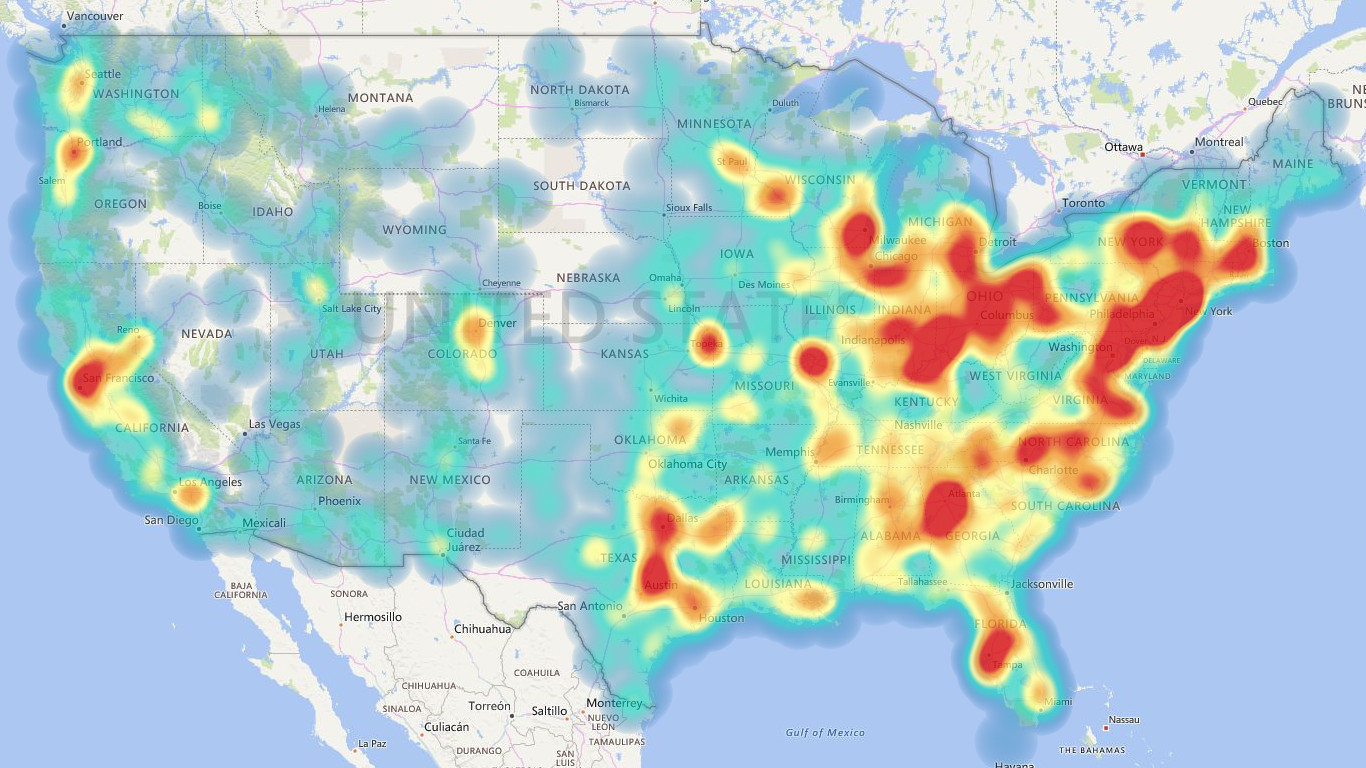
Visualize the density of data points as a heatmap.
Heat maps are a type of visualization to show data density on a map. They are particularly helpful when you have a lot of (e.g., tens of thousands of) data points on the map and are mainly interested in their overall distribution. Technically, in a heatmap, data points are aggregated locally and mapped to colors (either gradient or quantile), so that we can make better sense of the density of the data from the colors while still being able to see and use the map. For more information, please visit: https://weiweicui.github.io/PowerBI-Heatmap
Możliwości wizualizacji
Gdy ta wizualizacja jest używana,
- Może uzyskiwać dostęp do zewnętrznych usług lub zasobów
W skrócie
By getting this product, I give Microsoft permission to use or share my account information so that the provider can contact me regarding this product and related products. I agree to the provider's warunki użytkowania and zasady ochrony prywatności and understand that the rights to use this product do not come from Microsoft, unless Microsoft is the provider. Use of warunki is governed by separate ochrona prywatności and {4}.