FiltersClear all
Apps results
Showing 775 results in apps.
Power BI visualsRemove Power BI visuals
Power PlatformRemove Power Platform

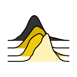
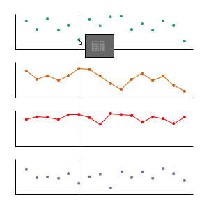
Ridgeline Plot by PowervizTRUVIZ INC Power BI visualsVisualize the trends and distribution across multiple categories as density plots
Applicable to:Power BI visuals
1 out of 60

swBoxPlot上北智信Power BI visuals1.箱线图组件能够明确的展示离群点的信息,同时能够让我们了解数据是否对称,数据如何分组、数据的峰度
Applicable to:Power BI visuals

Text Enhancer by MAQ SoftwareMAQ LLCPower BI visualsCustomize the text in your Power BI reports | PBI certified
Applicable to:Power BI visuals
3 out of 60

Power Automate Process Mining - Variant DNA VisualMicrosoft Dynamics 365Power BI visualsVisualize business processes in a way that displays processes as if they were DNA blocks.
Applicable to:Power BI visuals
4 out of 60

Drill Down Combo PRO (Filter) by ZoomChartsZoomChartsPower BI visualsCombine columns, lines and areas in one chart. Enjoy interactive drilldowns and beautiful design.
Applicable to:Power BI visuals
5 out of 60
Clustered Stacked Column Chart (Pro)PBIVizEdit.comPower BI visualsTo compare two numerical variables by category with each column further segmented by sub-categories
Applicable to:Power BI visuals
6 out of 60

Walkers Animated PictogramWishyoulizationPower BI visualsAn animated pictographic bar chart for building visually appealing reports.
Applicable to:Power BI visuals
7 out of 60
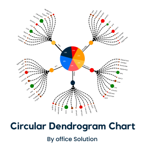
Circular Dendrogram Chart for Power BIOffice SolutionPower BI visualsCircular Dendrogram Chart for Power BI by office solutions
Applicable to:Power BI visuals
8 out of 60
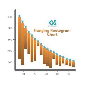
Hanging Rootogram Chart for Power BIOffice SolutionPower BI visualsA hanging rootogram chart is a specialized type of bar chart used in statistical analysis
Applicable to:Power BI visuals
9 out of 60

Multiple Axes Chart (Standard)PBIVizEdit.comPower BI visualsShow relationship between data sets by combining columns, lines, scatter, area on dual Y-axes
Applicable to:Power BI visuals
10 out of 60

videoplayerpbiCraftPower BI visualsVideo player to watch any embedded video
Applicable to:Power BI visuals
11 out of 60

Growth Rate Chart by DJEENI v1.4DJEENI BVPower BI visualsEnhance a line and column chart by adding extra relative or absolute column (growth) comparisons
Applicable to:Power BI visuals
12 out of 60

Risk Matrix by ProfitbaseProfitbase ASPower BI visualsFrom Insight to Action — Familiar Risk Visualization with Profitbase Risk Matrix
Applicable to:Power BI visuals
13 out of 60
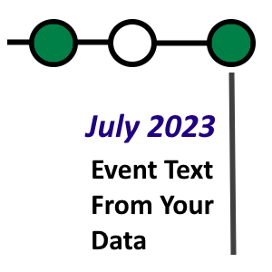
Time-lines (BI-Champ Suite)CodeX Enterprises LLCPower BI visualsCreate a time-line with dots representing events, keyed by dates.
Applicable to:Power BI visuals
14 out of 60

Composed Line Area Bar Chart by Devlup FunnelsDevlup FunnelsPower BI visualsThe Composed Line Area Bar Chart is a visually engaging data visualization that combines the feature
Applicable to:Power BI visuals
15 out of 60
Beeswarm ChartExcelnaccess.comPower BI visualsVisualize distribution of data across different categories
Applicable to:Power BI visuals
16 out of 60

Laconic Card - FreeDotelus ABPower BI visualsA clutter-free card visual for displaying your KPIs.
Applicable to:Power BI visuals
17 out of 60

Dumbbell Bar ChartNova SilvaPower BI visualsUnleash the power of comparison with the Dumbbell Bar Chart
Applicable to:Power BI visuals
18 out of 60

Variance - Dynamics 365 Finance business performance planningMicrosoft Dynamics 365Power BI visualsVisualize and bridge budget-actual gaps with precision.
Applicable to:Power BI visuals
19 out of 60

KPI Column by MAQ SoftwareMAQ LLCPower BI visualsMeasure your progress toward key performance indicators (KPIs) with integrated line and column chart
Applicable to:Power BI visuals
20 out of 60

ValQ-PlanxViz LLCPower BI visualsValQ for planning, budgeting, forecasting, what-if simulations, scenario analysis and reporting
Applicable to:Power BI visuals
21 out of 60
Advanced Trellis / Small Multiples - xVizxViz LLCPower BI visuals
xViz Advanced Trellis visual is a group of similar charts having a common axis and value fields
Applicable to:Power BI visuals
22 out of 60

ProgBarIT-DEV GmbHPower BI visualsProgBar: visual representation of percentage share
Applicable to:Power BI visuals
23 out of 60

Power Slicer北京上北智信科技有限公司Power BI visualsMulti-dimensional slices have been added and support for default dynamics
Applicable to:Power BI visuals
24 out of 60

Mapa Polski - Województwa, Powiaty, GminyEngagy P.S.A.Power BI visualsPolska w Twoich Rękach: aktualna Mapa Polski z podziałem na województwa powiaty i gminy!
Applicable to:Power BI visuals
25 out of 60

swSankeyDiagram上北智信Power BI visuals桑基图即桑基能量分流图,也叫桑基能量平衡图。它是一种特定类型的流程图,图中延伸的分支的宽度对应数据流量的大小。
Applicable to:Power BI visuals
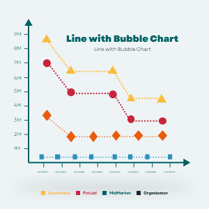
Line with Bubble ChartOffice SolutionPower BI visualsChart with combination of Line & bubble in which both objects can be derive with a numerical measure
Applicable to:Power BI visuals
27 out of 60

Lollipop Bar Chart (Standard)PBIVizEdit.comPower BI visualsA clearer visualization than bar charts for large number of categories
Applicable to:Power BI visuals
28 out of 60

Horizontal Bullet Chart (Standard)PBIVizEdit.comPower BI visualsShow progress of measure towards a goal and/or its performance against a reference
Applicable to:Power BI visuals
29 out of 60

Funnel with Source by MAQ SoftwareMAQ LLCPower BI visualsTrack data pipeline from end to end by grouping data into stages and sources | PBI certified
Applicable to:Power BI visuals
30 out of 60

Enlighten SlicerENLIGHTEN DESIGNSPower BI visualsProvides a simple way to interact with your data.
Applicable to:Power BI visuals
31 out of 60
Multiple Stacked ChartsPro2Future GmbHPower BI visualsVisual for comparing multiple data columns that share one X-axis.
Applicable to:Power BI visuals
32 out of 60

graphomate chartsgraphomatePower BI visualsgraphomate charts is a highly customizable visualization component
Applicable to:Power BI visuals
33 out of 60

Counter CalendarIT-DEV GmbHPower BI visualsTrack your data changes in time!
Applicable to:Power BI visuals
34 out of 60

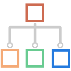
Organization Chart北京上北智信科技有限公司Power BI visualsA standardized structure diagram generation control.
Applicable to:Power BI visuals
35 out of 60
swOrgChart上北智信Power BI visuals该可视化可以应用于公司组织结构、家族族谱等业务场景。
Applicable to:Power BI visuals
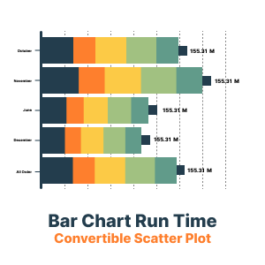
Bar Chart Run Time Convertible Scatter PlotOffice SolutionPower BI visualsBar Chart Run Time Convertible in Scatter Plot
Applicable to:Power BI visuals
37 out of 60
egHeatmapegnite, Inc.Power BI visualsA heatmap table to see different values per row by color.
Applicable to:Power BI visuals
38 out of 60

Dual Y-Axis Column Chart (Standard)PBIVizEdit.comPower BI visualsEasily illustrate the relationships between two variables with different magnitudes
Applicable to:Power BI visuals
39 out of 60
Dual Y-Axis Combo Chart (Pro)PBIVizEdit.comPower BI visualsShow relationship between data sets by combining columns, lines, scatter, area on dual Y-axes
Applicable to:Power BI visuals
40 out of 60

Pie Charts TreeAritz FrancoyPower BI visualsDisplay in tree mode with values represented in a pie chart in each node.
Applicable to:Power BI visuals
41 out of 60

Acterys Matrix LightManagilityPower BI visualsFlexible matrix reporting with selective drill down and filtering.
Applicable to:Power BI visuals
42 out of 60
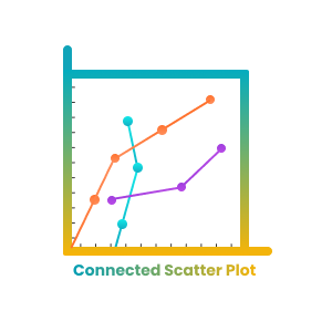
Connected Scatter Plot Chart For Power BIOffice SolutionPower BI visualsA connected scatter plot is a type of data visualization that show the data of X and Y axis
Applicable to:Power BI visuals
43 out of 60

Drill Down Network PRO (Pin) by ZoomChartsZoomChartsPower BI visualsCreate beautiful, easy to explore networks from category-based data.
Applicable to:Power BI visuals
44 out of 60
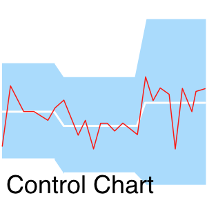
Control ChartNova SilvaPower BI visualsThe most useful way to see true signals of change in your KPI is to use a ControlChart (XmR chart)
Applicable to:Power BI visuals
45 out of 60
swColorMap上北智信Power BI visuals中国色块地图下钻,可支持下钻到省县级,可根据数据展示色块分布。
Applicable to:Power BI visuals

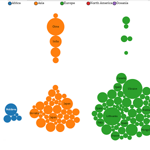
PackedBubbleChartQatar Financial Centre Regulatory AuthorityPower BI visualsPacked Bubble Chart
Applicable to:Power BI visuals
Event ViewerDataScenariosPower BI visualsThe Event Viewer chart visualizes device events over time. Ideal for IoT devices that report states.
Applicable to:Power BI visuals
48 out of 60
Multi-Format / Animation / Text From Values Card (BI-Champ suite)CodeX Enterprises LLCPower BI visualsTransform source data into a range of output formats - supporting animations, templates and copy
Applicable to:Power BI visuals
49 out of 60
Category Comparison Bar ChartDatanautsPower BI visualsThe Bar Chart you've probably never seen before
Applicable to:Power BI visuals
50 out of 60
Advanced Donut and Pie Chart (Pro)PBIVizEdit.comPower BI visualsVisualize the dominating or underperforming categories of the total
Applicable to:Power BI visuals
51 out of 60

ArcGIS for Power BIEsri, Inc.Power BI visualsCustom data visualization to bring mapping capabilities to your reports and dashboards.
Applicable to:Power BI visuals
52 out of 60

Waterfall - What's driving my variations?DataMaPower BI visualsSmart waterfall that illustrates KPIs variations with mix effect, gap analysis, dimension scoring...
Applicable to:Power BI visuals
53 out of 60

Animator by SquillionSquillion Technology Private LimitedPower BI visualsElevate your reports with dynamic, engaging visuals that uncover insights and start conversations
Applicable to:Power BI visuals
54 out of 60

orcaviz-proOrcaVizPower BI visualsBring location intelligence to PowerBI with Orcaviz.com custom visuals
Applicable to:Power BI visuals
55 out of 60

Clustered Stacked Bar (Standard)PBIVizEdit.comPower BI visualsTo compare two numerical variables by category with each bar further segmented by sub-categories
Applicable to:Power BI visuals
56 out of 60

Icons by QueryonQueryonPower BI visualsAccess hundreds of open-source icons to elevate your user experience.
Applicable to:Power BI visuals
57 out of 60

Forecast using Neural Network by MAQ SoftwareMAQ LLCPower BI visualsUse the Neural Network algorithm to forecast future values based on historical data.
Applicable to:Power BI visuals
58 out of 60

Lollipop Bar ChartNova SilvaPower BI visualsDeclutter your comparisons with a Lollipop chart
Applicable to:Power BI visuals
59 out of 60

Ratings by MAQ SoftwareMAQ LLCPower BI visualsIndicate performance or approval scores within you Power BI reports.
Applicable to:Power BI visuals
60 out of 60